
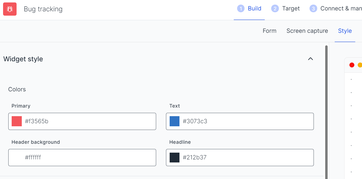
Style
Colors
The widget's primary color, the fields' text color, the colors of the header text, and the background can be set differently following your liking with the HTML color codes.
What is the best header size?We suggest using 250x150 px for the logo frame size.
Font
The Usersnap feedback widgets use GoogleFonts to make the widgets look nicer. If you don't want to use GoogleFonts, please check out Deactivate GoogleFonts in the feedback widgets.
Customize widget and survey designs.You can change change the colors, fonts and use your logos on the widgets or survey
This is a gated featurePlease contact our support for more details. customer success team
Widget position
There are 5 widget positions that you can configure from the drop-down.

Removing the Usersnap branding
The "Power by" link can be removed as a company(or higher) plan customer.
And as a Premium or Enterprise plan customer, the email correspondence can also be unbranded.

This is a gated featurePlease contact our support for more details. customer success team
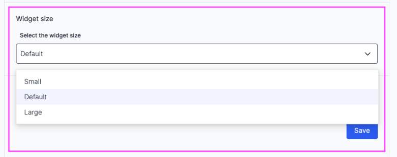
Widget size customization
There are 3 widget sizes you can choose from.
This feature offers the flexibility to, for instance, reveal important information on a webpage where the widget is popped without having it blocked.
Attention:This customization is not available for mobile SDK.
CSS custom styling
The widget can appear as a blocking or non-blocking widget (floating mode).
This means you can choose if the widgets show in a position relative to the browser window without blocking the rest of the page or not.
Attention:Usersnap does not support nor recommend any CSS custom styling of the widget.
Any override done on the users' end may potentially break the widget's functionalities.
Button styling
You can configure the styling of buttons in multiple ways, which include new shapes and sizes.
This is configurable in the ‘Build’ tab under ‘Style’
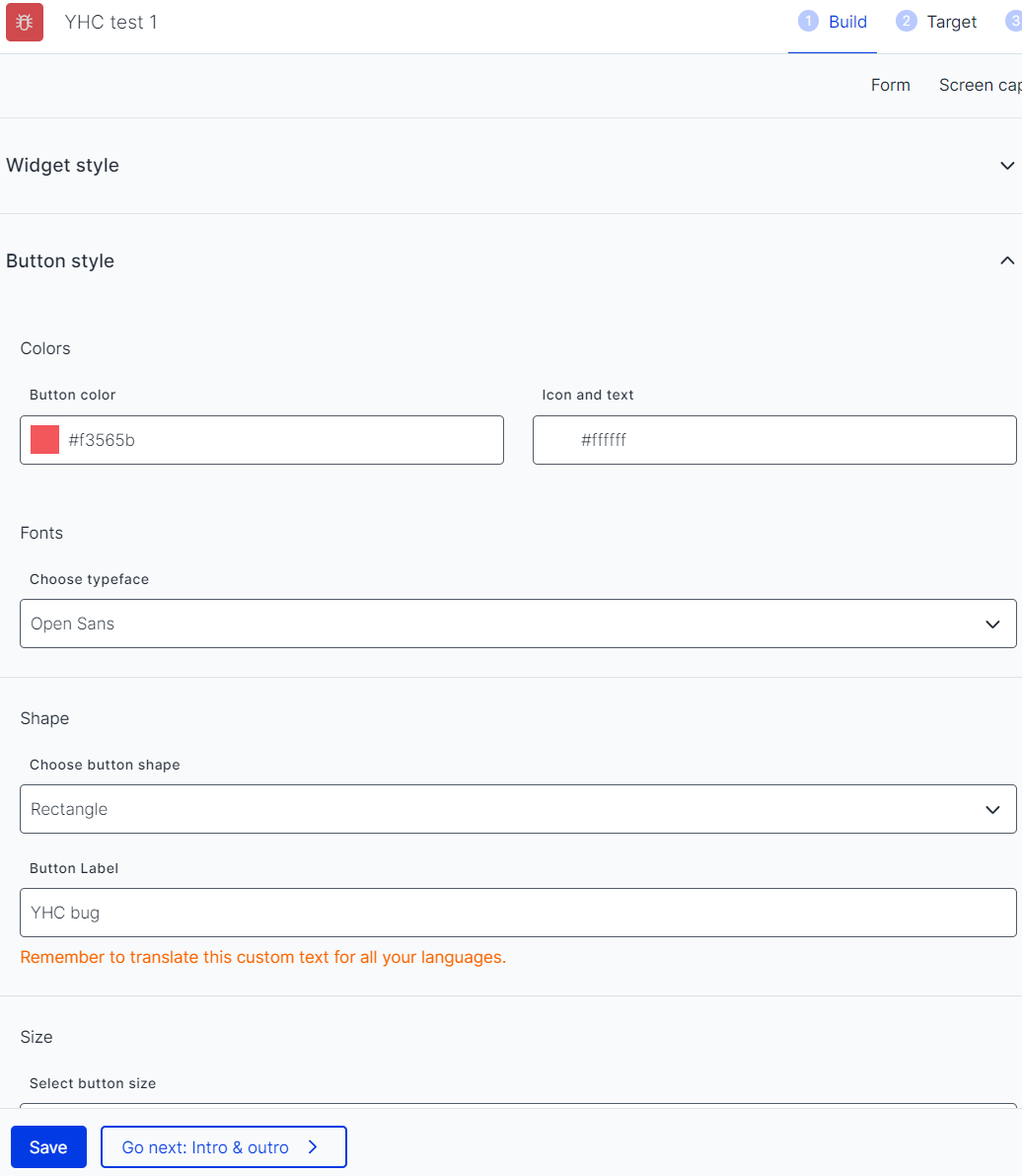
There are many shapes of the button you can select from, including the classic rectangle, a rectangle with rounded edges, a circle, and a square.
Here, you can separate the colors of buttons and widgets, as well as add a chosen set of icons and text to buttons.

The icons can be aligned left or right from the button text which can also change in color now.
The position change can only be configured for rectangular buttons and rectangular buttons with rounded edges
Sizes: small, default, and large

Updated about 1 year ago